Introduction – Your Story Starts Here
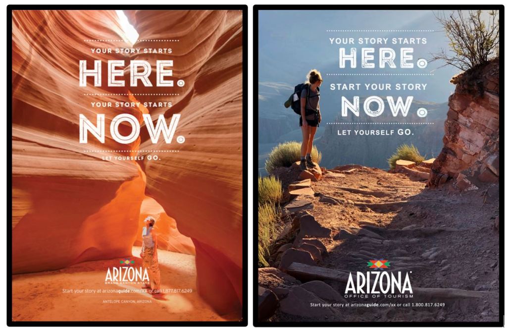
The ad campaign I chose to work on was a travel ad for an Arizona Tourism Guide. The above ad was found in an article highlighting the new ad campaign by Arizona Tourism. It depicts a woman looking up through Antelope Canyon. The design shows nature clean and untouched. The ad is promoting a tourism guide in Arizona to start a personal travel story. The ad series all has “Your Story Starts Here” and then variations depending on the destination picture.
Original Ad – Reverse Engineered
Typography – The ad uses San Serif throughout but in contrasting variations. The large bold words are a negative letter space outlined in thick white. The text throughout is in white giving it a pop from the monochromatic scenery. The chosen text color also matches the woman’s top tying it into the picture itself.

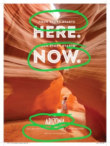
Colors – The ad is a variation of a black and white photo. It uses vermilion and white as the main colors. Monochromatic canyon allows the white only text to stand out and draw your attention. Antelope Canyons vermilion color is splendid in its contrast shadowing from the natural lighting. It allows the depth and texture to show through with the light vs. dark. The line pattern of layers implies the age and complexity of the canyon.
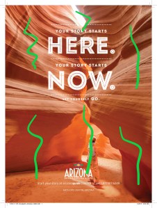
Design – Alignment of the text is all centered. This allows for space around to give more depth to the canyon. The woman is crowded with the lowest text but it seems to ground her to the canyon floor. Alignment of the woman is on the bottom third close to the center, following the rule of thirds. Her proximity to the canyon appears vast yet close. She is looking upward toward the light above. Seemingly reflective in thought of what story she is creating. The light emanating from above gives contrast to the textured canyon. The lack of many colors makes the actual tones attract you to the light and dark. The colors are repetitive and allow the text to stand out more in its repetition of small to large sizing.

Photo by Jacob Jolibois on Unsplash
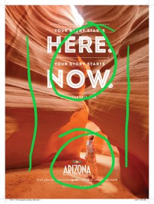
Created Ad – Reverse Engineered
Typography – The new ad continues the use of San Serif throughout. By the drastic difference of size of typography it lends to the overall contrast of the design. I kept the alignment centered, but did change the dotted lines more in framing the text. All text of like kind in the top are aligned with each other keeping the uniformity.
Colors – The new created ad has many colors in nature. The left upper side shows the muted tones of nature in light. While the lower right side shows the same in shadow. Unlike the original the multi colored photo shows the depth of the path the hiker is on. The light and dark shadowing does allow your eye to travel the path and feel the textures.
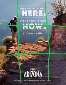

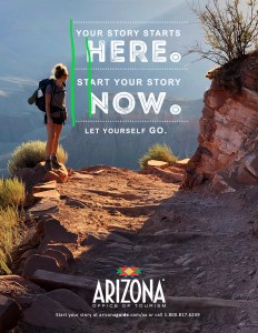
Design – Alignment of the text is all centered but also the different sizes ar aligned together. This allows the viewer to see the trail and hiker. Again the hiker is crowded to the text but instead to the top text. This lends to the height in which the hiker is at. The hiker is aligned in the left third following the rule of thirds. The hiker is also looking back out away from the photographer giving the impression of reflection of natures beauty and the story she is creating. The light coming around the bend gives a space of light on the path.
Conclusion – Your Story Starts Now
The original and new ad work together well promoting tourism to Arizona. They are similar in style and tone. They are different in location and in draw to the visitor. Both are breathtaking in subject without being the same. In looking at the campaign intention the two are similar in their call to explore Arizona. The information provided in the tourism guide gives the viewer the opportunities to explore. While one ad is mild in action (woman in canyon) the other requires more action (hiker with camp pack). The ads are appealing to two different demographics yet collectively to the same.