Ad for Trivago – Germany
“Stop traveling with your head”

- Link: https://www.adsoftheworld.com/media/print/trivago_stop_traveling_with_your_head
- School: Miami Ad School
- Published/Aired: September 2019
- Posted: January 11, 2020
- Description: Print advertisement created by Miami Ad School, Germany for Trivago, within the categories: Hospitality, Tourism, Professional Services.
- Credits: Advertising School: Miami Ad School, Hamburg, Germany.
- Art Director: Leon Kaiser
Introduction
This project is to use show the use of five elements of design: contrast, repetition, alignment, proximity, and color in an ad. I chose the blue version of the Trivago ad campaign called, “Stop traveling with your head.”
Contrast Analysis
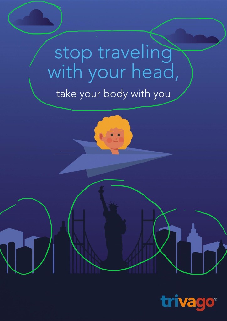
One form of contrast I found in this ad is in the representation of travel to a city via air through the clouds. The ad show contrast in the light and dark building outlines giving it depth. The text used shows contrast to the color scheme used in the artwork as well as contrast in the colors chosen. The clouds used are gradient also giving contrast to the color scheme.
Repetition Analysis

The ad shows repetition in the clouds at the top of the ad. The other element of repetition used is in the buildings with the bridge halves that flank the outline of the Statue of Liberty. The logo for Trivago in the ad is recognizable because of the consistency in its use through all media ad forms. The color scheme used in the logo helps viewers realize the pronunciation, further branding the company.
Alignment Analysis
The ad is broken vertically in half, mirroring each other. The alignment of the text is centered above the main focus of the head in a plane. This allows the catch phrase to work in complementing the art used. The logo in the bottom is right aligned and allows attention to be drawn but not overwhelming the point o the ad. The ad is broken into five horizontal sections, each one not over powering the other. The top three give travel a visual while the bottom two give a feel of being grounded to the destination.
Proximity Analysis

The proximity of the text to the head traveling ties the slogan to the art represented. With the head on a plane being first it leads to the destination of the city outline. The space between are close in proximity allowing the slogan to be well represented. The logo at the bottom right give the feeling of established in the foundation of the ad without overwhelming the art itself.
Color Analysis

This ad primarily shows color using blue in different hues. Going from a dark navy to a light blue. The head on the plane also ties into the logo color scheme by the yellow used. The clouds are using a gradient blue giving depth and contrast to the top of the ad. Using the blue hues gives a sense of uniformity throughout the ad.
Conclusion
This Trivago ad gives all of the elements of design we have been learning about. It is effective in not overwhelming the viewer because of the balance used. The monochrome blue gives the positive effect for the eye to catch the subtle contrasts. This allows the viewer to be effectively engaged to the ad. This is a good example of correct principles of design being used to an effective ad.
